Finders Keepers is my debut solo show with Ian Tan Gallery in Vancouver BC. Exhibition runs from March 28 - April 25.


notes on the work
BIG PICTURE
Over the last couple of years, a place called Refuge Cove has been my favourite subject. It’s a water-access only community on West Redonda Island in Desolation Sound. There are many special things about it that attract me as a painter. It’s an inviting and cozy tucked-in place that only reveals itself after entering the inlet. There is a year-round community there that have made all sorts of interesting homes on the shore as well as some fascinatingly ramshackle float homes. There are no cars, just trails and some well-weathered docks and boardwalks.There is an old-timey general store and even a little art gallery. This contrast of the natural and industrial, and the industrial breaking back down to nature, is compelling to me and has long been a part of my work. I think a lot about our relationship to the land and how we can do better.
Growing up in the Yukon, I remember that my mom, an artist talented in many mediums, loved to photograph and sketch run-down shacks set against the breathtaking Yukon scenery. There is a bit of a tradition in the Yukon, with its obsession with the Gold Rush, of depicting run down cabins and decaying mining infrastructure, so I guess that’s part of me. Since she passed away, I miss my mom a great deal and visiting places she would have loved makes me feel closer to her.
SHAREHOLDERS
It’s all about the land! And the water. Living on the coast it can be hard to believe that water isn’t plentiful everywhere. The simple “X” composition portrays a narrow spit between bodies of water, maybe at low tide, exposing big old stumps and shellfish. Lots of structures are here, some look like homes and some more like workplaces, like mines or canneries. There is a busy little ecosystem of shareholders in this isolated community. There is a decommissioned ship that might now be apartments. There are bottle shape forms, representing different possibilities. Artifacts of settlers. Simple cabins with smokestacks. They are a way to play with scale, and to introduce hard edges to contrast the organic shapes and lines of the trees and hills. You’ll notice the colourful candy coloured ghosts trailing off the corner. I was thinking of PacMan, and how the little ghosts would run off the edge of the screen to appear on the other side. I found that so clever, and a way to suggest there is a world outside the screen. This is one tiny scene in a huge world. I also like to think of the ghosts as thoughts or worries, they come and go and can surprise you from behind. I’ve used a big drywall knife preloaded with colour to make some of the big swoops and shapes that form the landscape. I like to use different tools and different sized brushes to create something like a collage of styles.
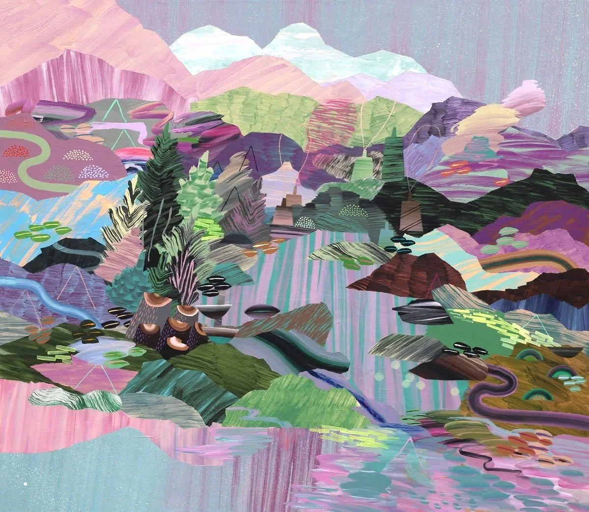
FINDERS KEEPERS
Strong vertical lines and swooping curves keep the eye moving in this stacked composition. There is sort of a watershed idea here. Different spots up and down river all connected by ribbons of water. Colourful streams flowing downhill to the water’s edge to become one. The hot contrast of ultramarine blue and magenta in the middle-left create a focal point, a central path for the eye. I love that kind of extreme contrast, the discord that happens when colours opposite each other on the colour wheel are placed side by side. You can also see it, toned down a little bit, on the stripy patch of pink and blue at the middle of the right edge. See it how it almost vibrates? I try to use direct compliments sparingly as not to overwhelm, but just as special pockets of excitement. This painting embodies the kind of energetic resonance I was hoping to achieve.
SCATTER FORMS
While I’ve used the same kinds of painting and masking techniques here as in the rest of the series, Scatter Forms and Bottomless show a zoomed out perspective, using symbolic shapes to represent different kinds of places and activities throughout the scene. Many years ago, when there was still a BC Festival of the Arts, I had to opportunity to be mentored by Canadian painter and art professor Norman Yates. He shared a lesson that still sticks with me. He had us tear a sheet of newsprint against the grain. Tearing it against the grain creates a rough and unpredictable organic tear. He then had us use the torn edge as a stencil, which in my painting instantly created the most believable mountain ridge! In combination with the straight edge forms I was fond of, introducing organic lines brought a new and much richer element to my work. I replicate that exercise in this work with masking tape. I tear the masking tape down the middle and use the rough edge to mask out, to isolate shapes. The masking allows me to create contained areas of energetic brushwork. The containers are stacked in space to create the illusion of collage or patchwork.
BOTTOMLESS
There is an exploration here of soft and hard forms. Softness of colour, direction of shape, and placement in the picture plane render some shapes hard as mountains, and others soft like clouds and smoke. This painting veers pretty far from representation into abstract territory, allowing me to think of it just in terms of colours, values and shapes and think less about subject, more about the elements of design. Rhythm, repetition, texture, balance, scale, harmony, contrast, line, space - are all considerations coming together to create this imaginary scene. Abstraction is interesting - some might think that it’s the easiest thing to do (my 4 year old could do that!) but I think it’s one of those things where you have to know the rules to break the rules. I aspire to make a good non-representational painting at some point in my life! And also to paint like a 4 year old. I am frequently inspired by/jealous of the art of young kids, the stuff they make before they are self-conscious, before knowing what things are “supposed to” look like.
COMING RIGHT UP
My friend Janet sometimes helps me with my titles. This painting might have been called “The Exciting Marbles” which I liked, but also didn’t like, in that it felt too specific. I try to avoid telling an audience what they are seeing. I prefer to find a title that opens a painting up to questions and ideas. So she asked me what other ideas I had and I said “coming right up” as I was looking for my list. Janet said, “oh, I like that!” So the name was a happy accident. What I like about the title is the action is suggests, it made me visualize the trees along the top as young poplars just shooting up overnight. It automatically felt more up lifting. I particularly enjoyed painting the bottom half of the painting. Painting water is such a trip! It can be handled in so many ways. Still water can offer a perfect reflection, moving water an opportunity for all kinds of expressive painting. To me this water looks the pigment is overflowing from all the foliage above. There is a bit of rawness to this piece - some of the structures have been left without all the details, in some cases just a suggestion, a few steps or a roofline, is enough. Perhaps it’s still under construction, or maybe it’s collapsing with age.
FRONT ROW
As a painter, it’s vital for me to keep innovating and growing, setting new challenges and trying to make things I have’t made yet. I’m excited about the step in my artistic evolution that this piece represents. I’m interested in paintings of interiors, and as a landscape painter, it’s a challenge I have yet to tackle.
Last fall I had the experience on a lifetime, I went to Venice for the Biennale. As well as having my mind blown by Venice and the art fair, I visited the Peggy Guggenheim Collection, which houses some very significant modern art, Peggy Guggenheim’s taste through her collecting and patronage shaped the direction of modern art full stop. One of the most lasting images for me was an installation of 23 small blue glass figures by Egidio Costantini, modelled after Picasso sketches. The figures were placed on glass shelves in a window, layered in front of an elaborate grate with the Grand Canal of Venice visible in the background. The figures in a window gave me the idea to place something similar in my painting, as a way to suggest an interior without actually painting an interior. In Front Row the window sill might be the railing of a porch, but regardless, it introduces the idea of a distinct point of view. Now that these items are placed in the foreground, I imagine that I am sitting on a shady porch on a little house maybe not unlike the little house across the water. I also like that there is a new layer of narrative. Each item in the collection has a backstory and was found and kept for some reason or another.
The scene depicted here is the painting in the collection that most resembles my beloved Refuge Cove.